
Published On Aug 4, 2020
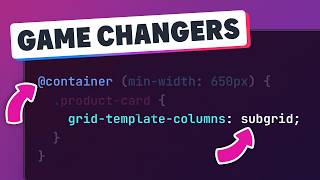
Long thought impossible, Heydon Pickering has found a way to replicate the idea of container queries using a cool CSS trick / hack using a clever combination of flex-wrap, flex-basis, and flex-grow. It's a really powerful trick.
We'll still need media queries for stuff, but this could prove to be really, really handy!
Heydon's original article on The Holy Albatross: https://heydonworks.com/article/the-f...
His follow-up: https://heydonworks.com/article/the-f...
More info on Emmet: https://docs.emmet.io/
/// Timestamps
00:00 - Introduction
1:34 - basic setup
3:05 - understanding flex-wrap
4:10 - understanding flex-basis
5:57 - understanding flex-grow and shrink
7:33 - putting them all together
8:29 - negative flex-basis
9:13 - no media query required
11:08 - getting it working at a precise size
12:54 - the true power of it
16:10 - outro
#css #containerqueries
--
Come hang out with other dev's in my Discord Community
💬 / discord
---
Keep up to date with everything I'm up to
✉ https://www.kevinpowell.co/newsletter
---
Help support my channel
👨🎓 Get a course: https://www.kevinpowell.co/courses
👕 Buy a shirt: https://teespring.com/stores/making-t...
💖 Support me on Patreon: / kevinpowell
---
My editor: VS Code - https://code.visualstudio.com/
---
I'm on some other places on the internet too!
If you'd like a behind the scenes and previews of what's coming up on my YouTube channel, make sure to follow me on Instagram and Twitter.
Instagram: / kevinpowell.co
Twitter: / kevinjpowell
Codepen: https://codepen.io/kevinpowell/
Github: https://github.com/kevin-powell
---
And whatever you do, don't forget to keep on making your corner of the internet just a little bit more awesome!


